UA Design System
A proof of concept grassroots effort aimed at showing what could be possible if we invested in consistency.
Universal Audio has lacked consistency across its multiple platforms, within the same site, and from page to page, slowing down product development and making it very difficult to scale. Modifying existing designs had become a very manual process.
As we started building UAD Spark in Shopify, the first project in the new platform that would lay the foundation for a full redesign and e-commerce re-platform in the near future, we wanted to start introducing a level of systems thinking and use this as a trial run to prove how investing in a design system may benefit the company.
Goals
Provide enough flexibility to allow Marketing to build pages with minimal learning curve.
Clearly document styles that could be repeated in a design program like Figma or in code.
Create a shared language between design and development to ensure we can scale as we move forward.
- Create a proof of concept design system to fund the future investment of resources.
0
Single source of truth
100+
Templates
1000’s
Hours wasted reinventing the wheel
“
It’s hard to estimate how long this story will take until I see the design, as it’ll likely be different than anything we have.”
— Developer
“
Can we make this look more like the campaign artwork?”
— Stakeholder
The mess we were in...
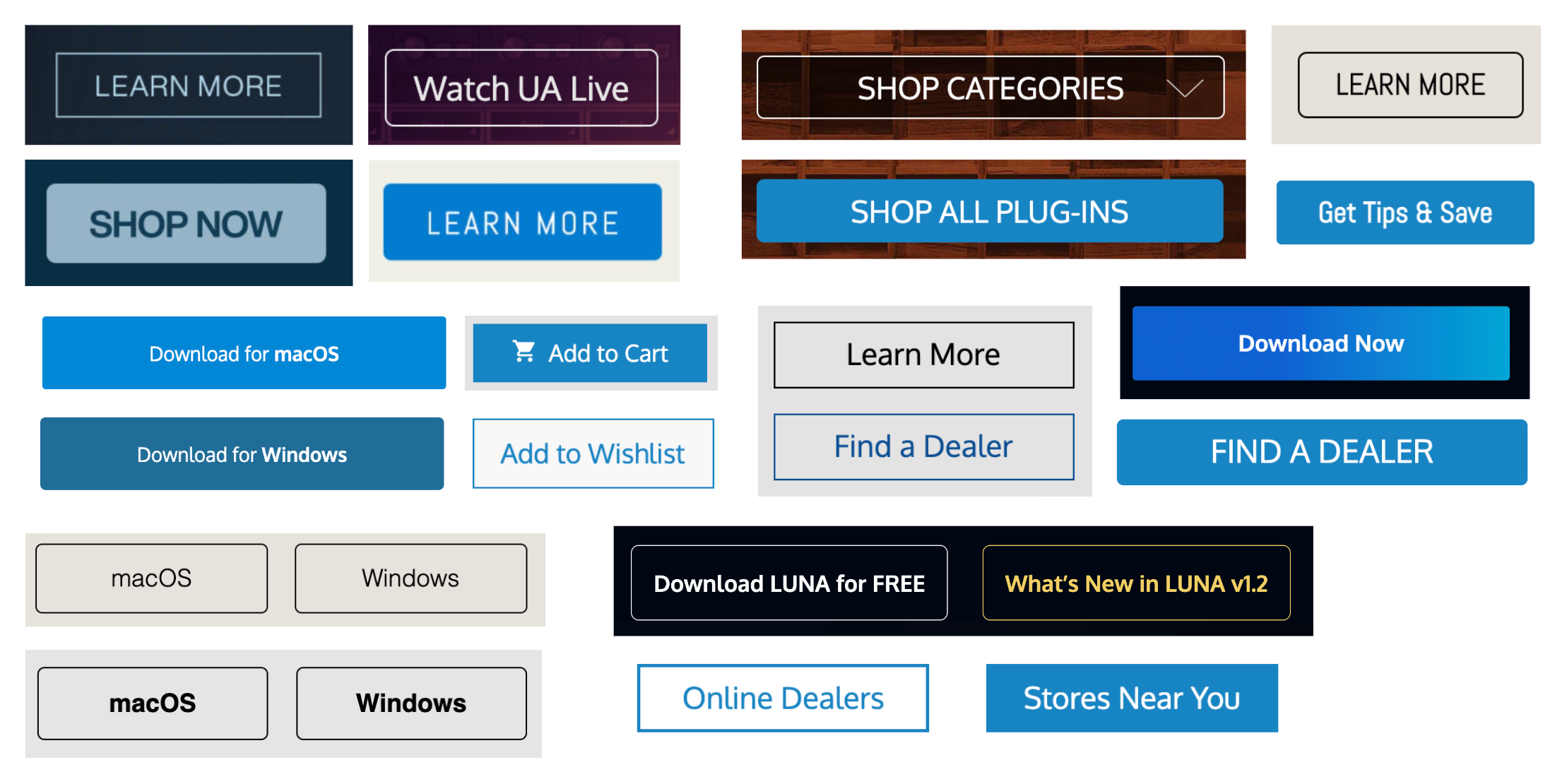
What we set out to do
The challenge
Some senior leaders and design stakeholders have a strong marketing background and tend to prefer something that feels consistent contextually within the page or within a brand or campaign over respecting the consistency of the web experience as a whole.
Approach
The most important thing for us was to build with the system in mind. We continuously asked ourselves questions like “Does this work if in 2 years Marketing decides to change the look/feel of the site?”, “Is this solution scalable?”, or “How can we build flexibility while maintaining consistency?”.
Typography
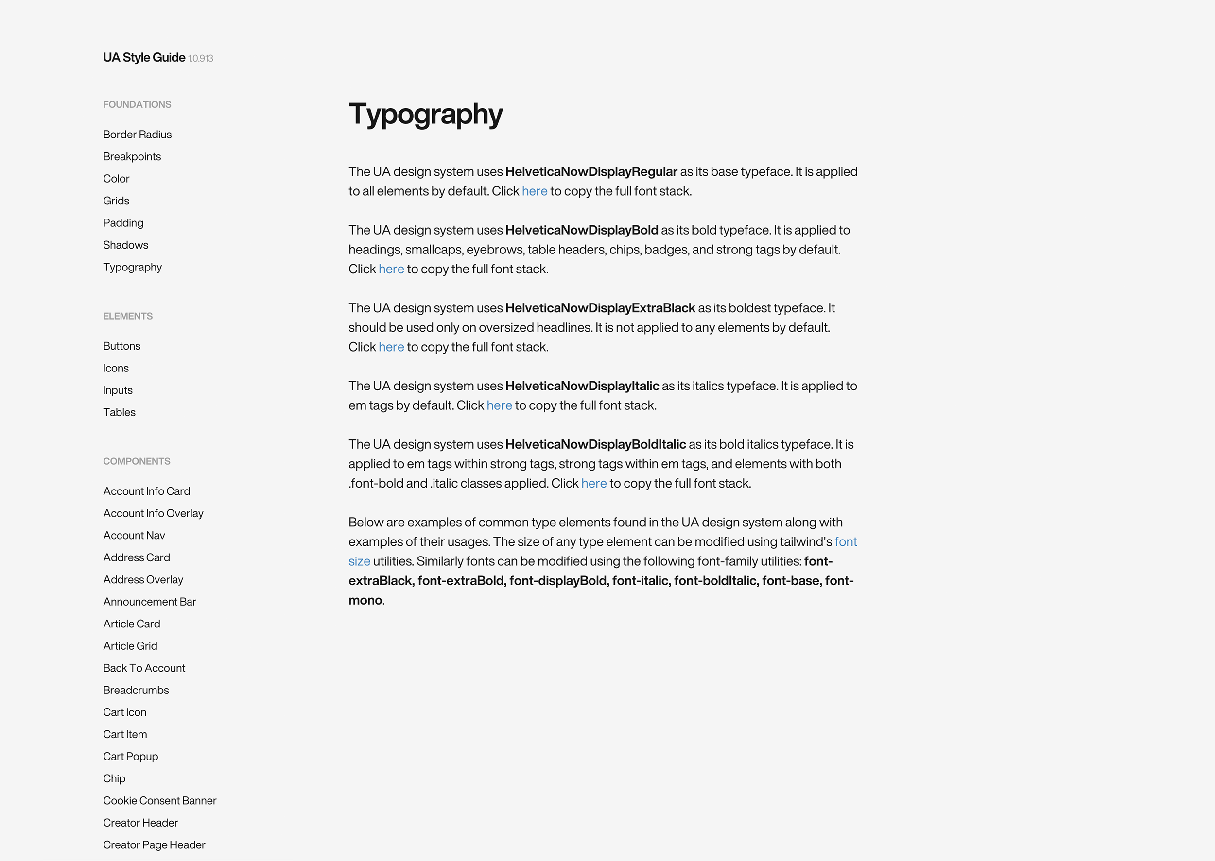
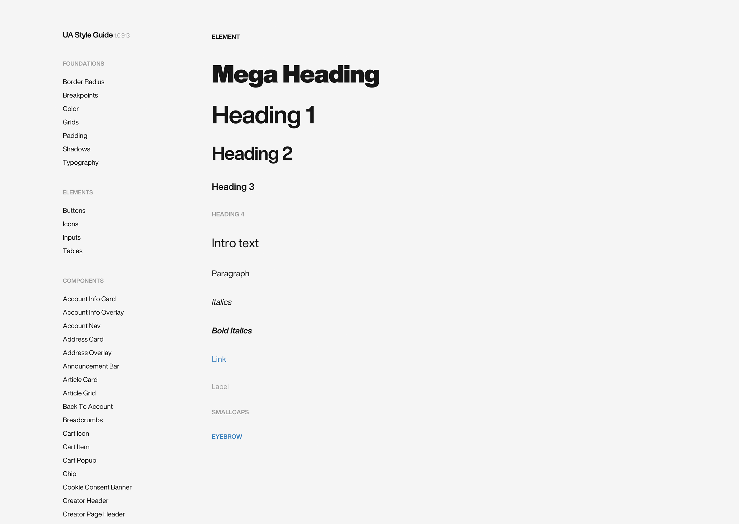
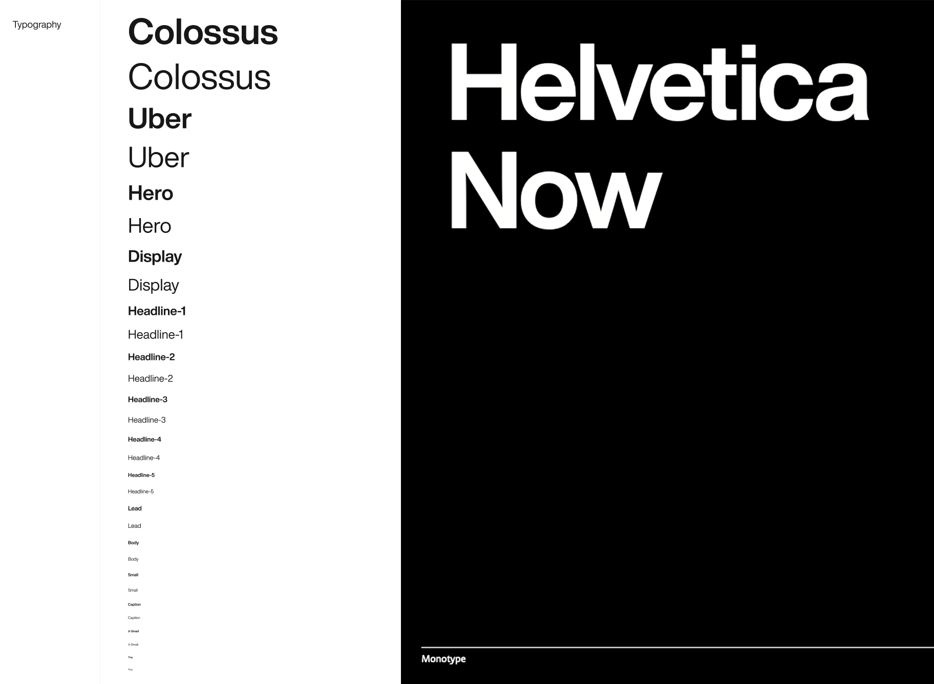
We built a typography scale that allowed users of the system to choose from a wide variety of font sizes to fit their needs. We actually rebranded through this process, and licensed Helvetica Now from Monotype, as our new company typeface moving forward, which allowed UA more flexibility, and a timeless look.
tips_and_updates FUN FACT: we used a UI kit to speed up our workflow of this proof of concept called Cabana. It was created by Mark Andrew, and I highly recommend it as a starting point.
Color
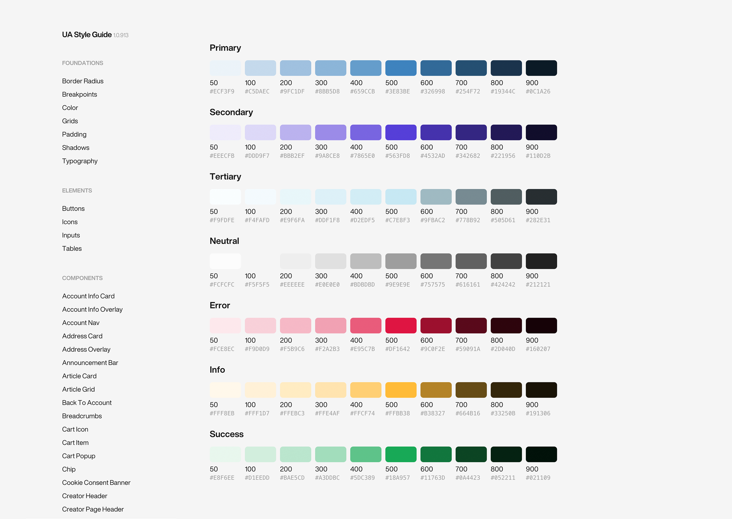
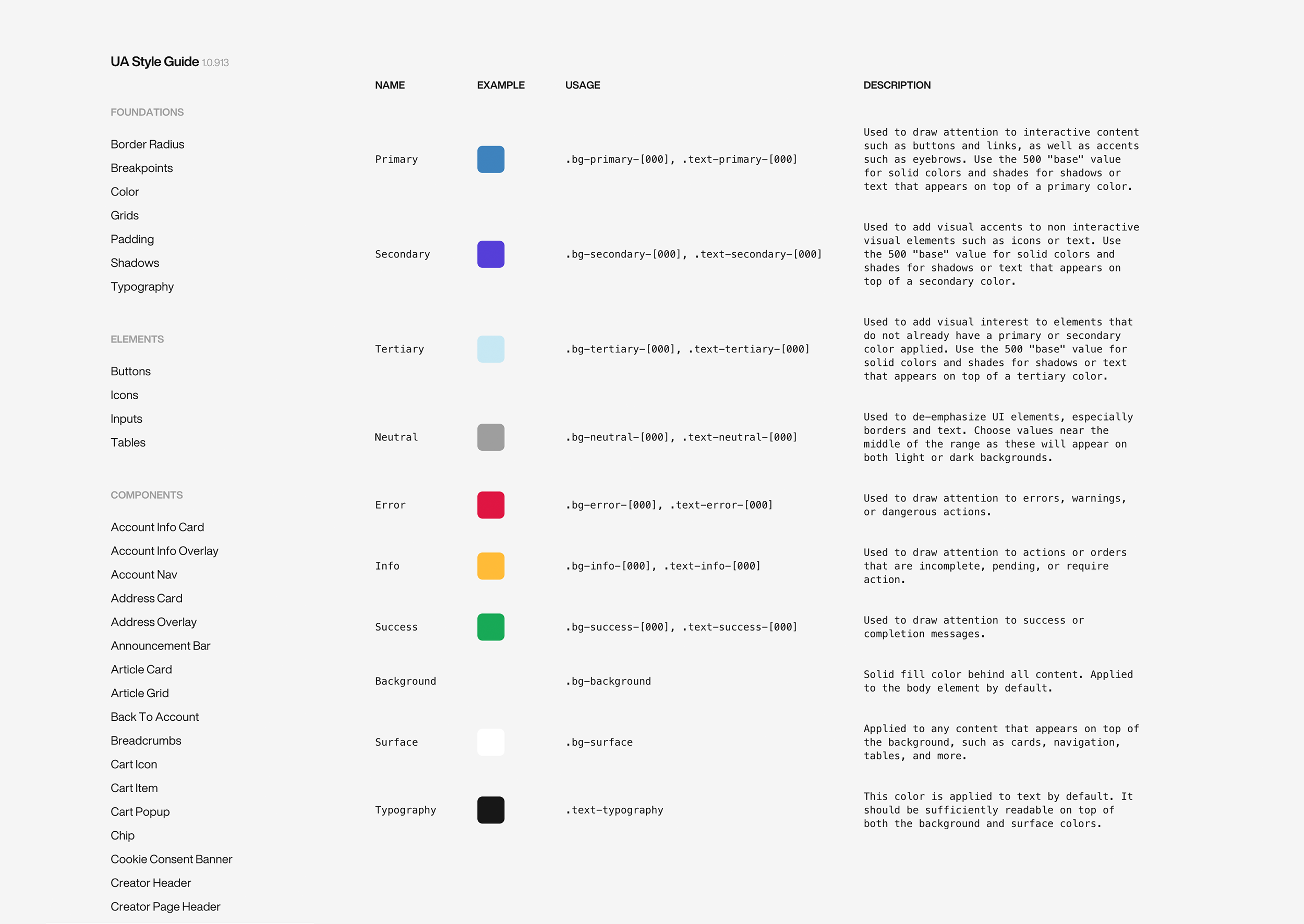
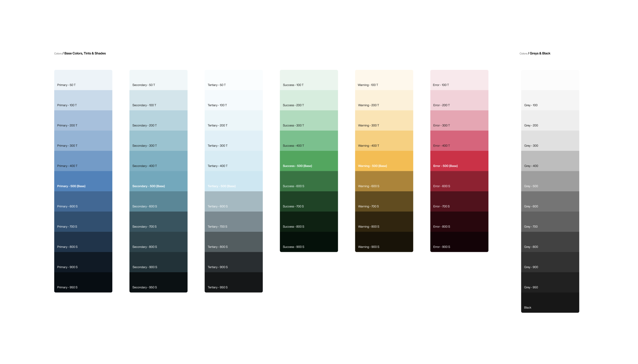
Having a wide color palette that can serve the needs of multiple teams is crucial in a design system. We used a standard approach for tints and shades, but in practice, probably about 20% of the colors are in use. Primary/Base 500 are the most commonly used, and the others are good tools to have in your back pocket when the need presents itself.
Icons
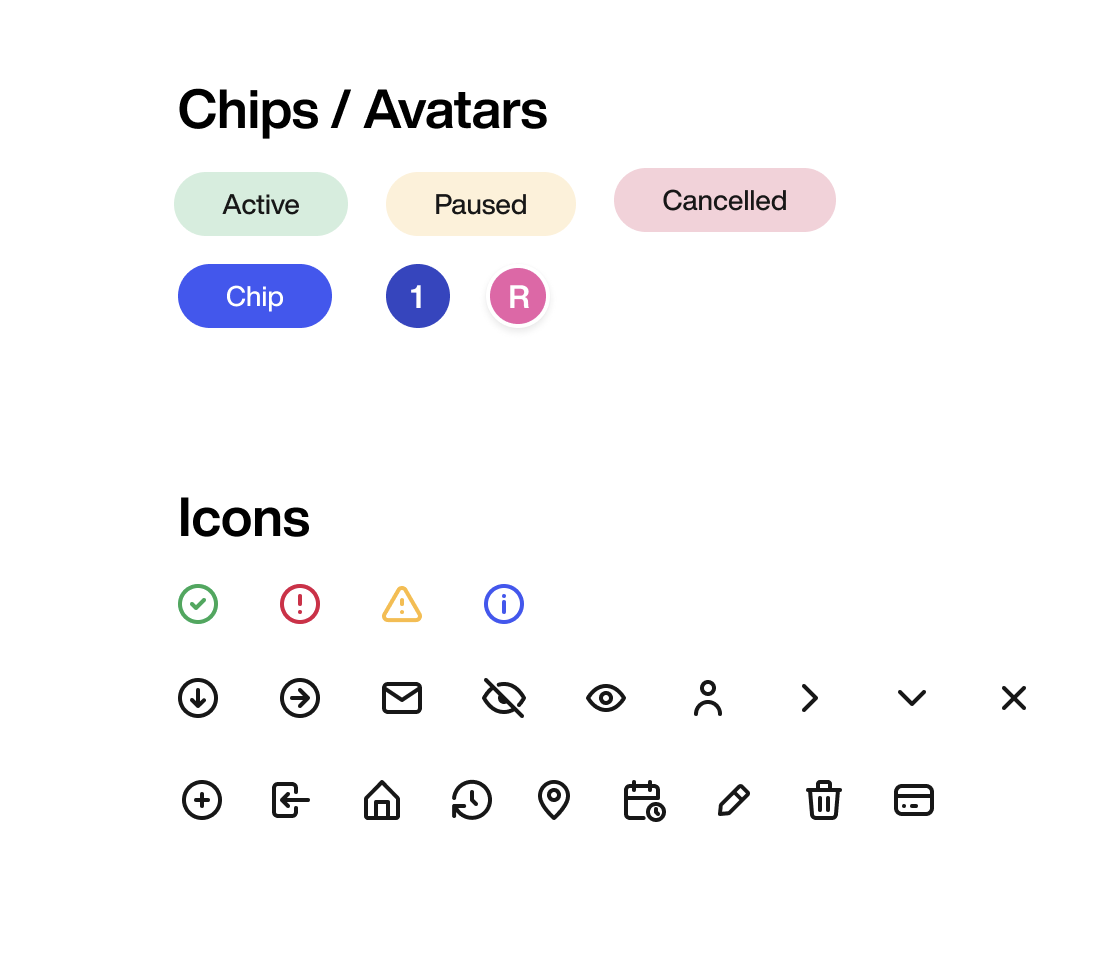
When it comes to icons, we started off with a set called Eva, which look beautiful and are represented below, but we’ve since pivoted to using material design icons, as they are in font format, are very versatile in terms of weight, fill, etc, and also match the timeless aesthetic of the brand.
Buttons
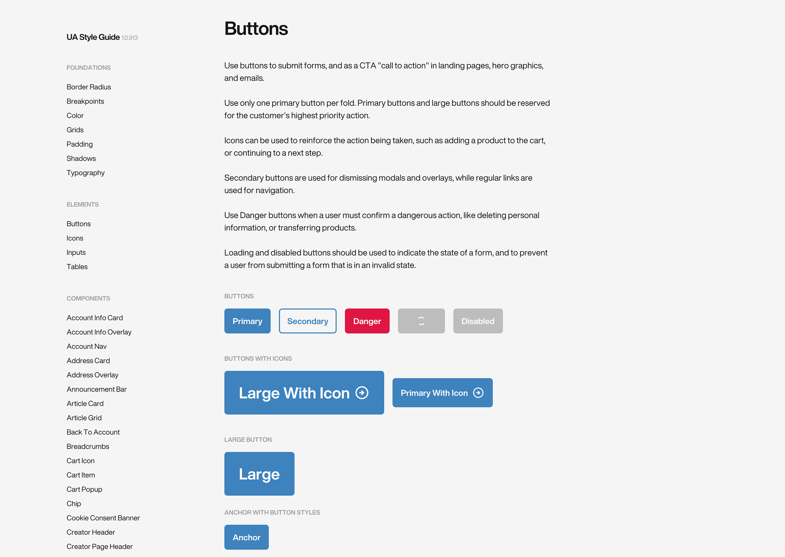
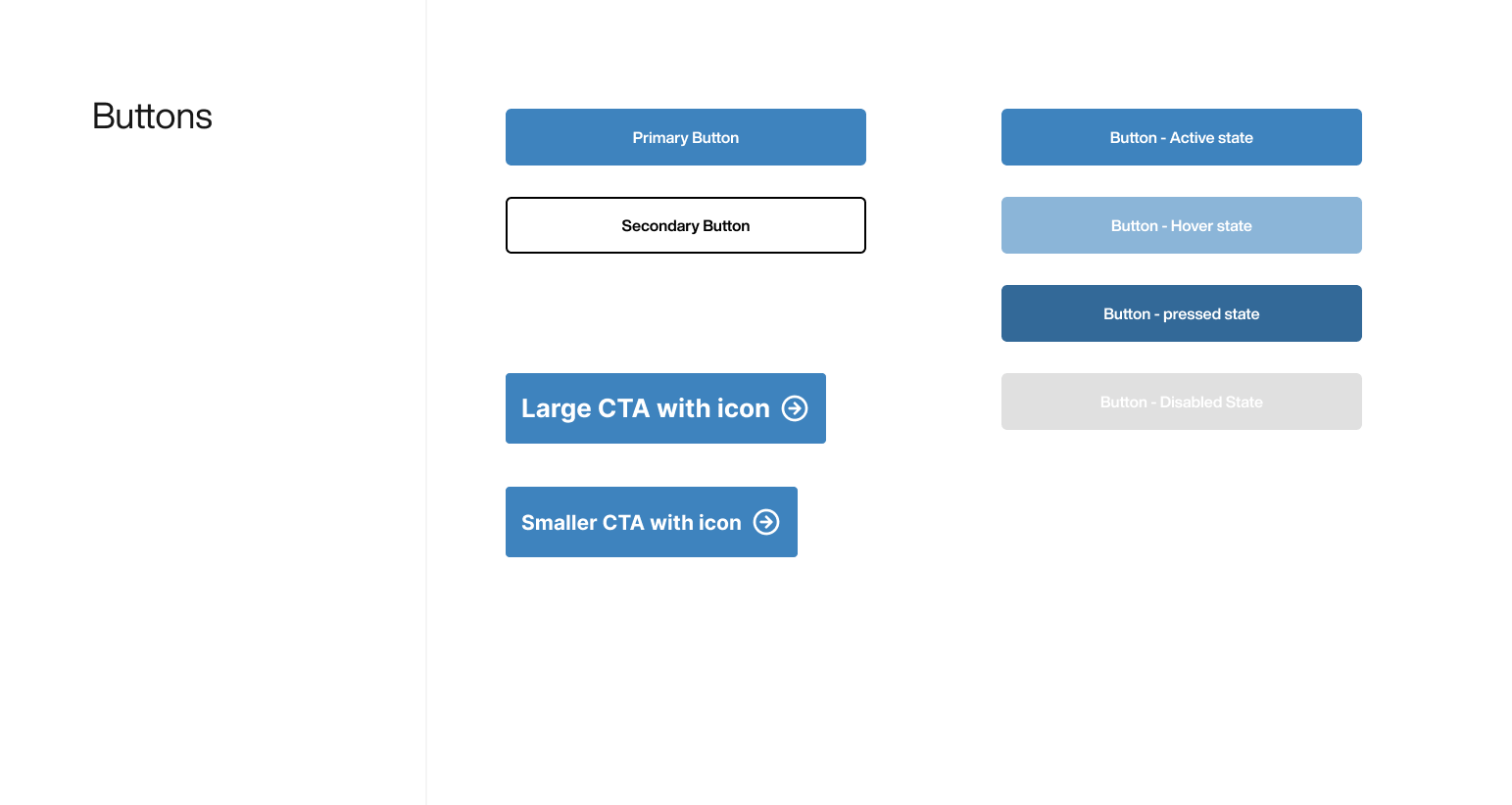
Buttons are one of the first elements to look at when trying to build consistency, and considering the multiple states of a button when building the component is key.
Grids & Spacing
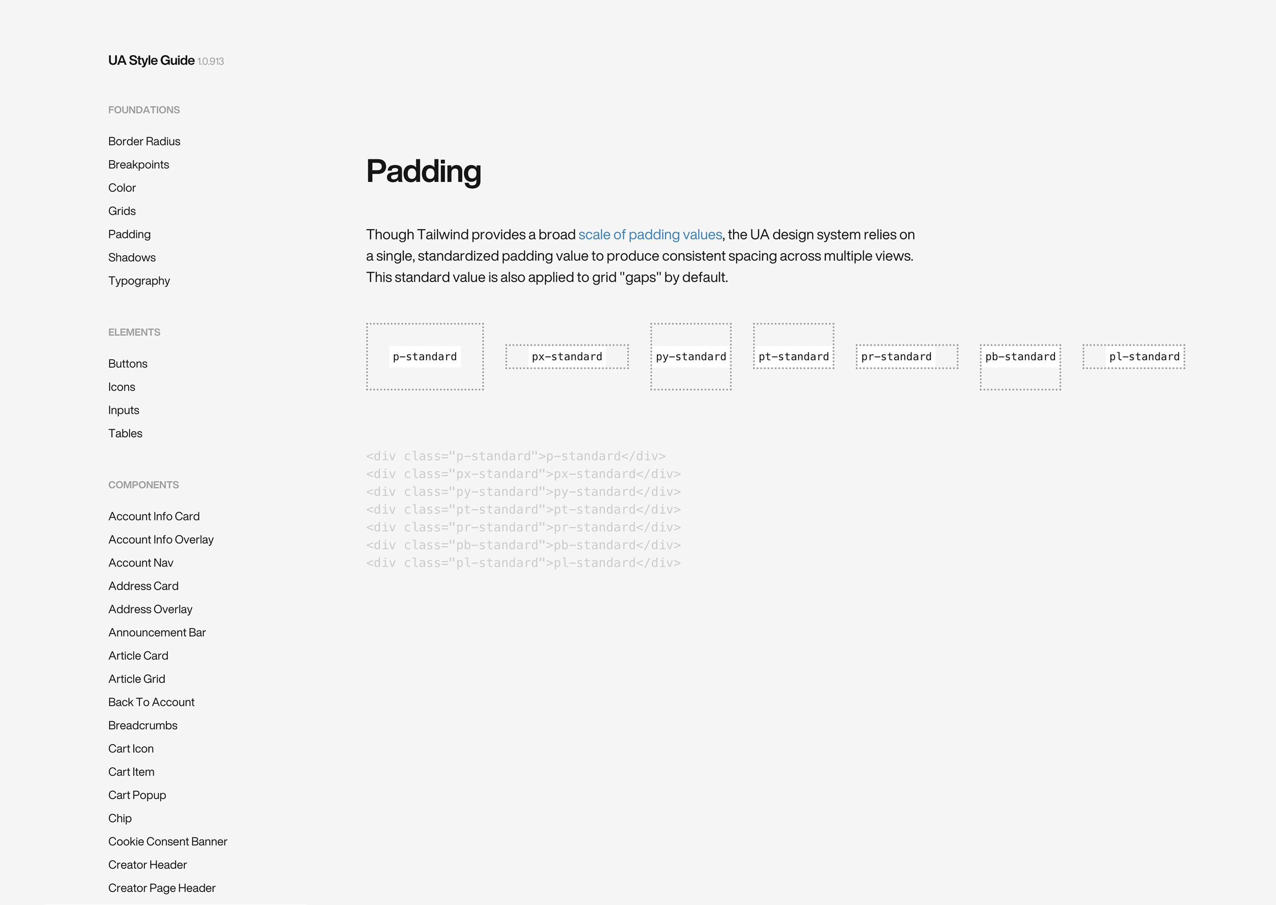
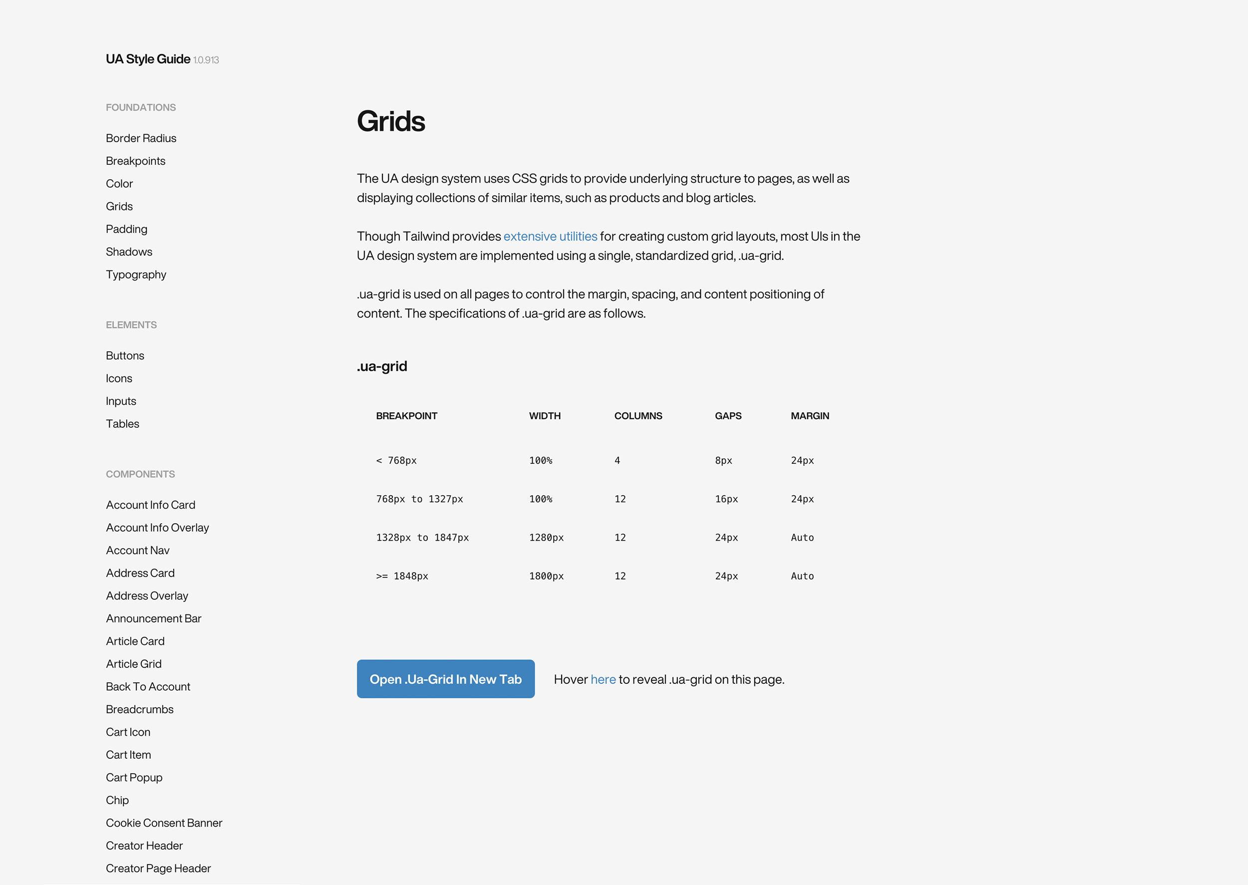
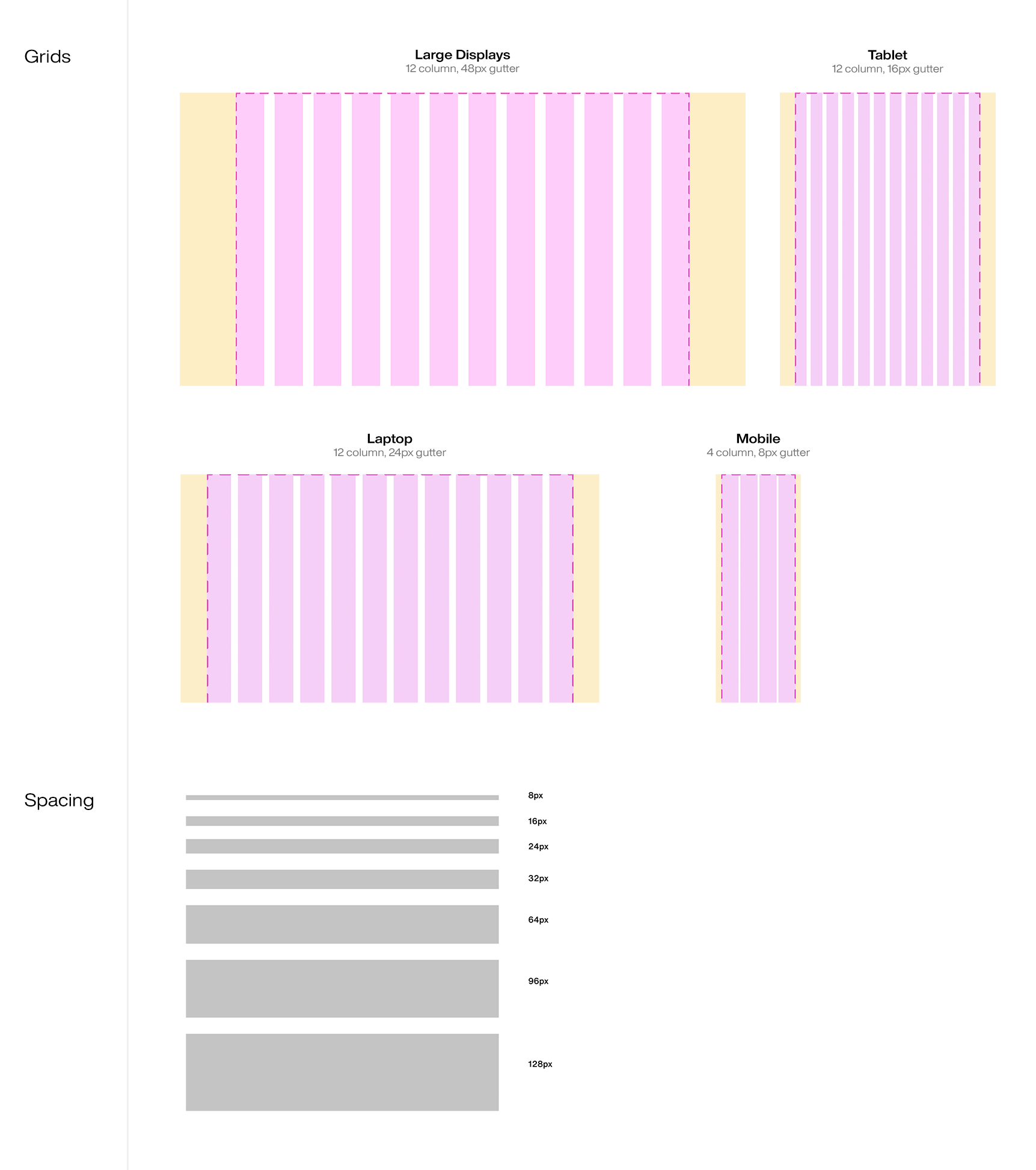
We used an 8px-based grid, which is easily multiplied, and is scalable. We’ve found that using an even number for both the baseline and the column makes it easier to calculate intervals in a responsive environment. Having a grid in place removes some of the guessing game, and speeds up workflows.
Shadows & Elevation
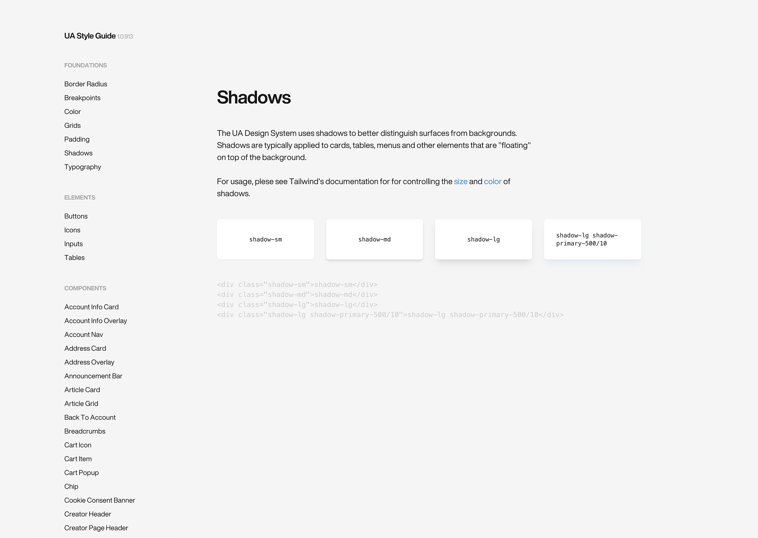
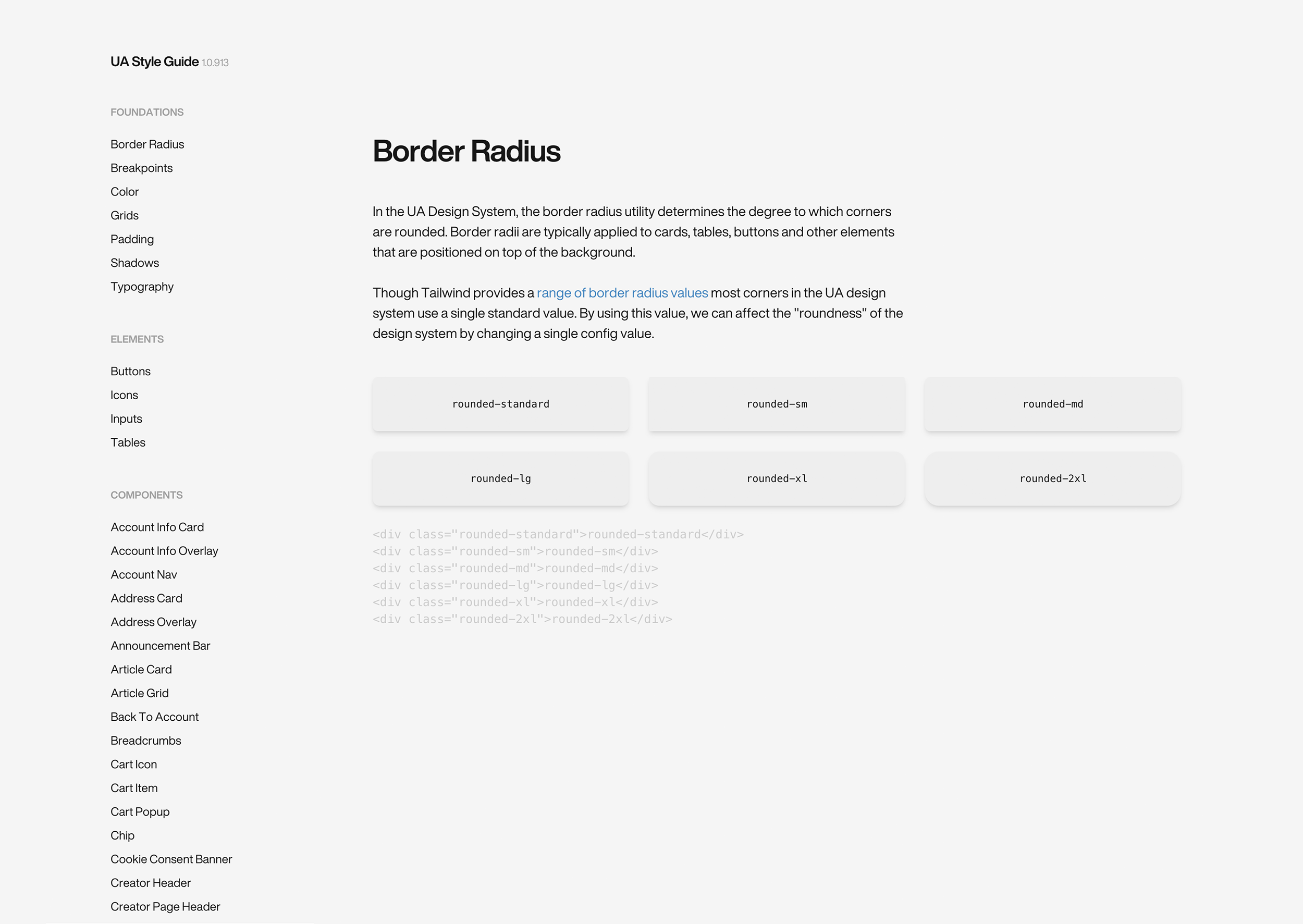
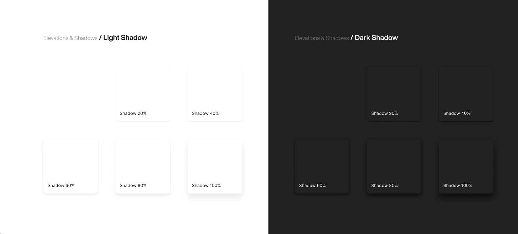
Having shadows in your system is optional, but it’s a good tool to help build consistency. They are more subtle than a primary button, but important nonetheless.
Notifications and alerts
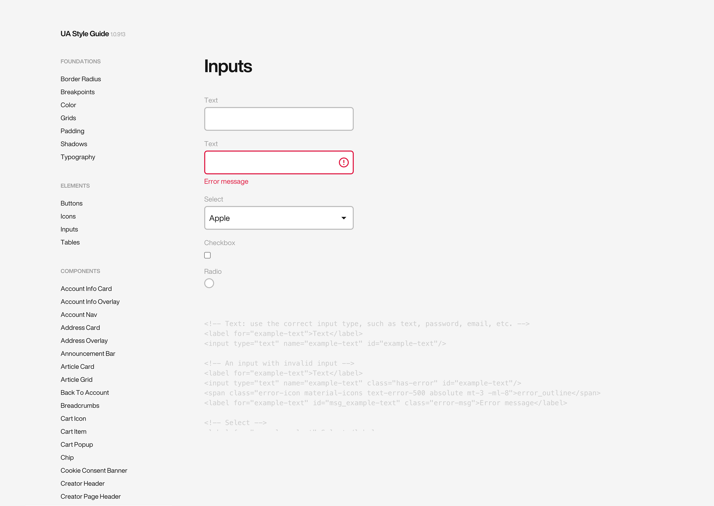
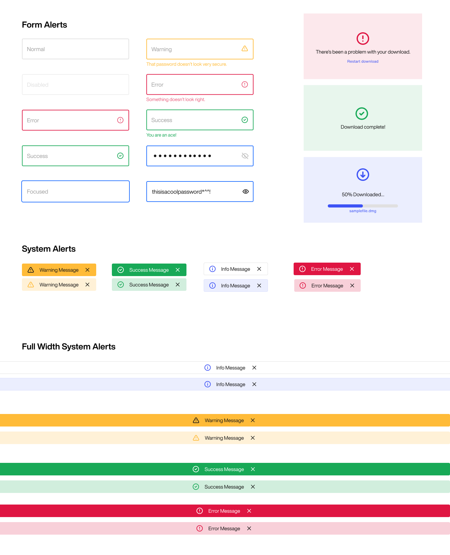
Probably one of the most crucial elements in a system is how the system talks back to you. That can be in the form of success, attention or error messages. Using contextual communication and good UX writing is key to building trust, and visual cues such as color and icons can help communicate this effectively to the user.
Naming
They say the most difficult thing about designing a system is naming. We used Tailwind CSS to name our components. Tailwind provides a framework for naming elements, that is abstract enough to ensure you don’t paint yourself in a corner. We had many discussions about it, and always asked the question “would someone else understand this without reading documentation?” or “is this solution scalable?”
Documentation and live code equivalent
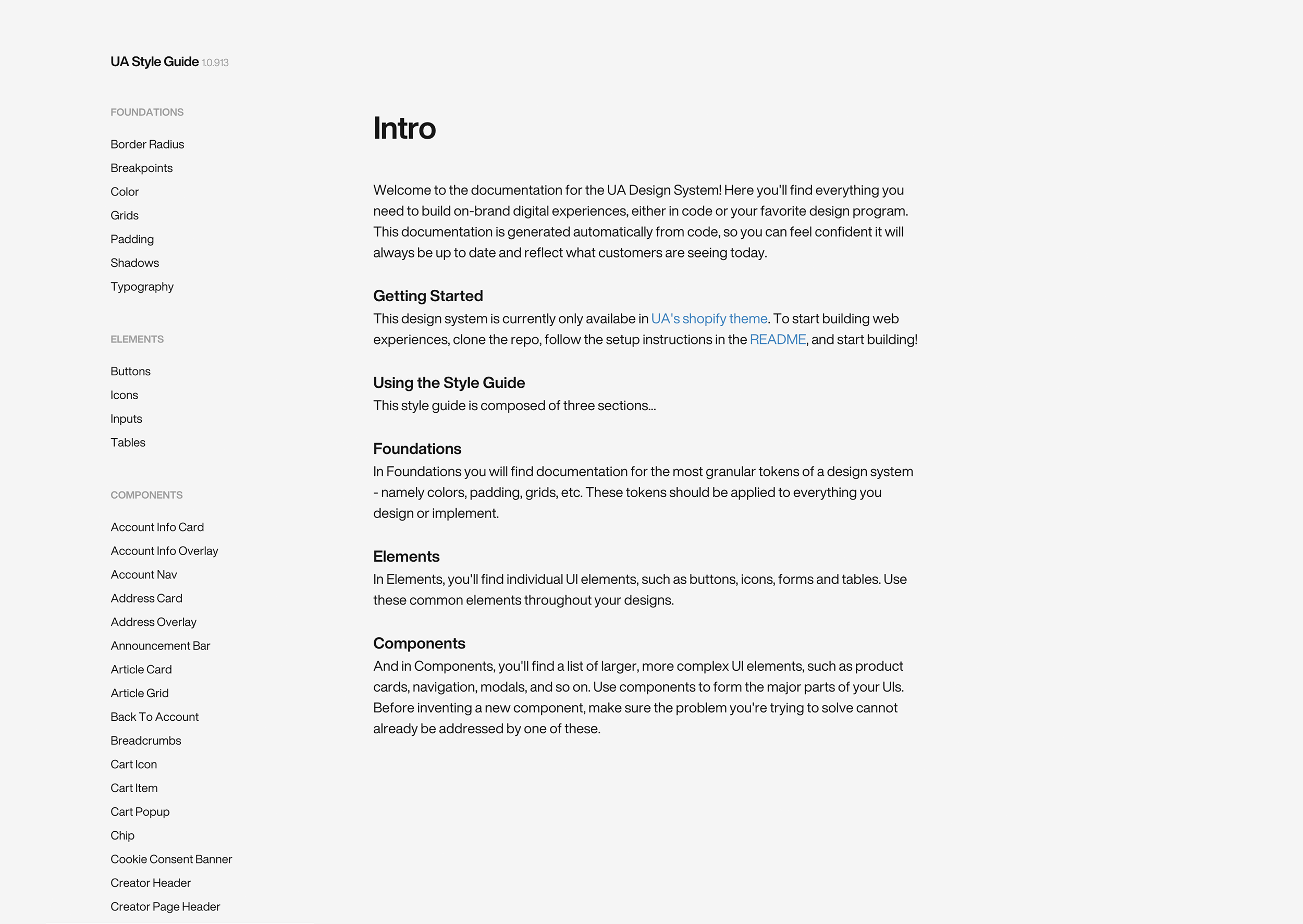
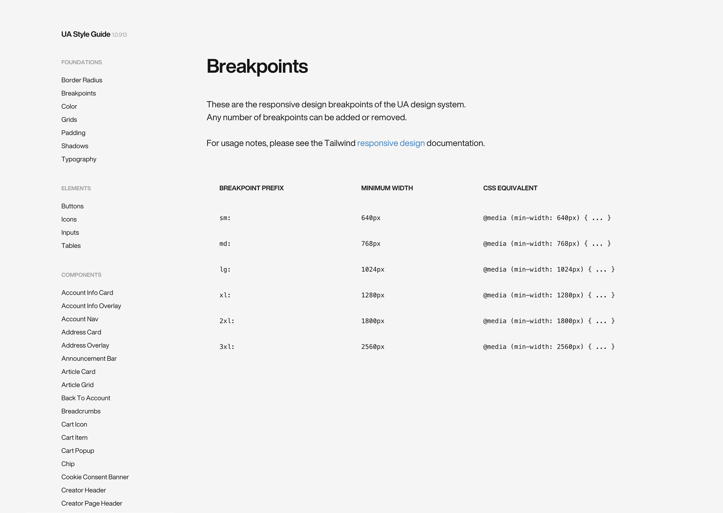
What good is a design system if it isn’t equally useful for designers and developers? Ryan did an amazing job at documenting everything and providing developers with a great starting point when starting from scratch.
Key Results
- This proof of concept was successful in aligning developers, designers, and stakeholders
The documented “style guide” that is in use today has saved dozens of hours when onboarding a new developer to the team
The system exists in Figma for any new visual designer to reference, and it’s saved dozens of hours for them as well
80
Reusable components
100’s
People hours saved
50%
More consistent
Next steps
This was a grassroots effort between Ryan and myself, to show the proof of concept of a design system. The next steps will involve getting buy-in from stakeholders and funding the project. As we scale and grow and the various platforms we use and support increase, it’s essential we find alignment around consistency while delivering quality at the pace the business requires to be successful.
